Working with dates in Excel can be challenging, especially when dealing with PivotTables. Inconsistent interpretation of dates can lead to incorrect aggregations and complicating analysis. But there’s a solution. You can dynamically filter date fields by adding a timeline to your PivotTable. This will introduce a new level of interactivity to your data analysis, making it more intuitive and unveiling valuable trends and patterns within your data.
To add an interactive timeline to your PivotTable, use the “PivotTable Analyze” ribbon and select “Insert Timeline” in the Filter section. Alternatively, right-click the desired date field in the “PivotTable Fields” window and select “Add as Timeline”.
In this post, I will dive into how you can set up an integrated timeline and how this interaction works with multiple PivotTables and PivotCharts.
Crafting Your First Timeline in a PivotTable
Creating a timeline in Excel’s PivotTable helps you quickly filter and analyze time-series data efficiently.
Making the data sent more interactive and looking sleek in the process!
To quickly create a dynamic timeline for your PivotTable, open your Excel workbook that contains your PivotTable and follow the instructions below.
- Select any cell within your PivotTable. Doing so will activate the ‘PivotTable Analyze’ Ribbon at the top of your Excel window.
- Within the ‘PivotTable Analyse’ Ribbon, locate the ‘Filter’ section and click ‘Insert Timeline‘.
- A dialog box labeled ‘Insert Timelines’ will appear, displaying all the date fields in your PivotTable.
- Select the date field you intend to analyze and hit ‘OK’.
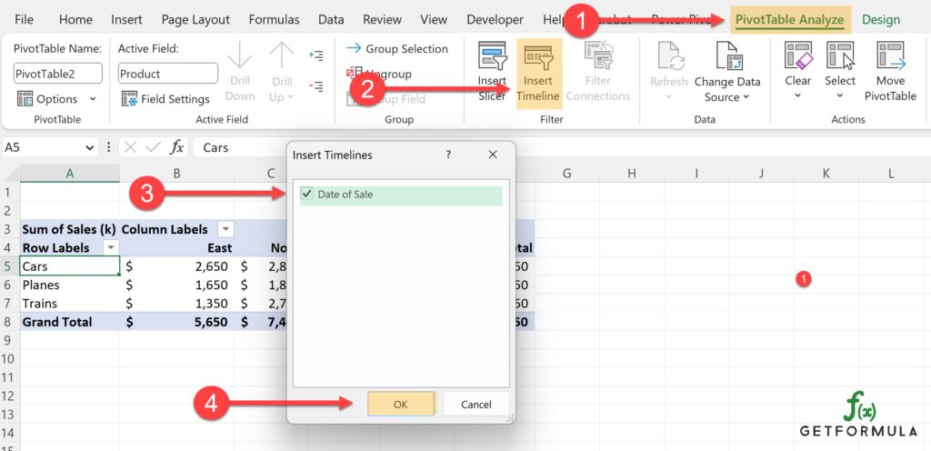
You’ve now added a timeline to your PivotTable!
You’ll now notice a new, interactive bar under your PivotTable. This is your timeline. It allows you to filter and focus your data on specific date ranges by dragging the slider handles or clicking on the date range you’re interested in.
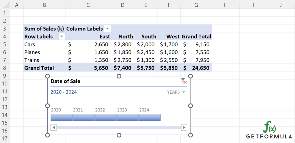
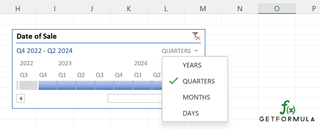
There are a variety of customization options you can leverage. For instance, you have the ability to change the timeframe units displayed (years, quarters, months, or days) by clicking on the ‘Timeframe’ drop-down in the upper-right corner of the timeline (highlighted in orange below).
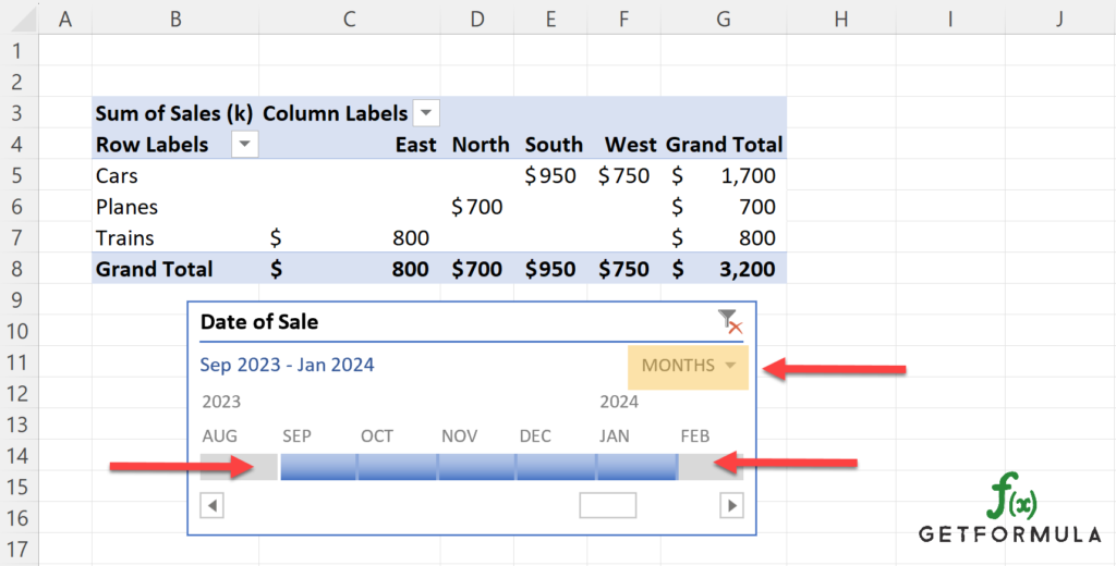
Remember, this timeline is dynamic! As you adjust the timeline, your PivotTable will automatically update to reflect the selected date range, offering an intuitive way to analyze temporal trends in your data.
How to Prepare Your Data for Excel PivotTables
Properly preparing your data is crucial before creating PivotTables and adding timelines in Excel.
Organize Data
Ensuring your data is clean and organized. Correctly formatted data will increase the efficiency and accuracy of your data analysis.
Start by examining your data set. It should be organized as a list with columns and rows, and each column should be named – these will serve as your field names in the PivotTable.
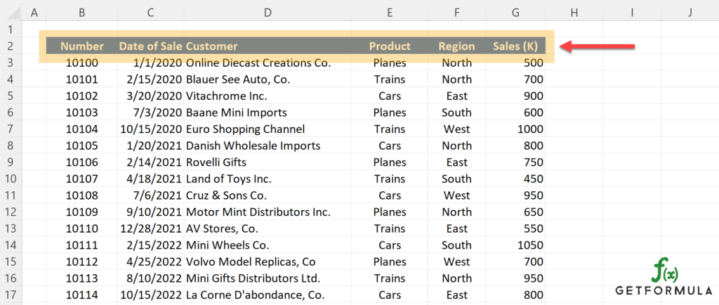
Ensure your data set doesn’t have blank rows or columns, as these can lead to errors when creating your PivotTable.
Also, check that each column contains the same type of data throughout.
Data Values
Excel PivotTables work best with continuous data; handling dates is a specific case. For the best results, ensure your dates are stored as dates, not text.
Excel recognizes and can set dates in many formats. I like to keep to short dates as they are simple and universally recognized, such as “MM/DD/YYYY” or “DD-MM-YYYY”.
Numbers
In terms of numbers, it’s crucial to ensure they’re stored as numbers and not as text.
If any number is stored as text, Excel cannot perform calculations on it, which is a fundamental aspect of PivotTables.
Once your data set is structured correctly, you can create a PivotTable and analyze your data more efficiently.
The better the initial data preparation, the smoother the process of creating PivotTables and timelines, resulting in more effective data analysis.
Preparing Data for Timelines in PivotTables
To create effective timelines in your PivotTables, it’s crucial to ensure your date data is correctly formatted and organized. Here, we will delve into the specifics of preparing date data for timeline creation in PivotTables.
Firstly, check your date data. Excel recognizes dates in many formats, sometimes interpreting them as text or numbers. This can lead to inconsistencies when you create a timeline.
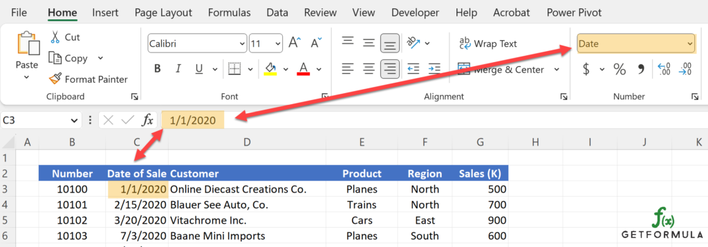
To avoid this, ensure your dates are stored as dates. You can check this by clicking on a cell and looking at the ‘Number’ group in the ‘Home’ tab. The type should be ‘Date’.
If the type is not ‘Date’, you can change it by selecting the column and then choosing ‘Date’ from the ‘Number Format’ drop-down list in the ‘Home’ ribbon.
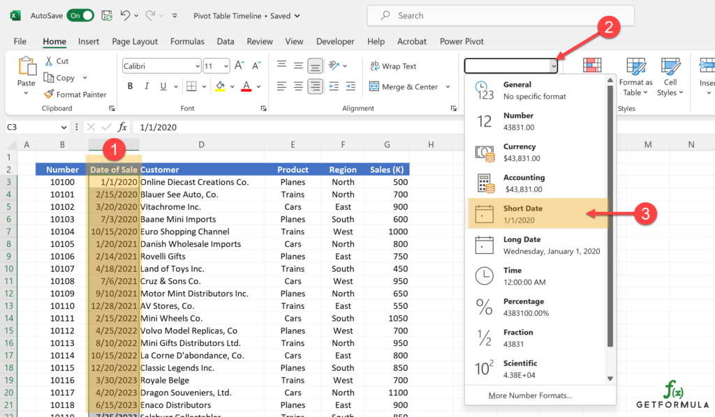
Consistency in date formats throughout the data set is essential. For example, if you use the “MM/DD/YYYY” format, ensure it is used consistently across all data points.
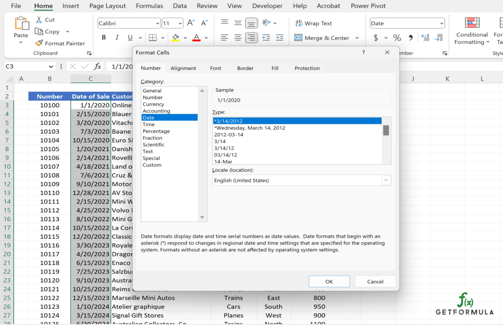
To ensure you set it to a desired date format, you can use the Format Cell window.:
- Select the data array in the table
- Use the shortcut “CTRL + 1” which will open up the Format Cell window.
- Then select Data category, desired format Type, and press OK
Another important guideline is to fill in or remove any blank cells in your date field. These can cause errors or inaccuracies in your timeline. You can easily spot and select blank cells using the ‘Go To Special’ function in the drop-down list on the ‘Home’ tab.
The following video shows how to use the “Go To Special” feature to find, select and delete rows that have blanks.
This next video shows how to use “Go To Special” to fill back cells with data from the previous cell.
Once your date data is correctly formatted and cleaned, you can add a timeline to your PivotTable. The preparation might seem daunting initially, but these steps ensure a smooth, error-free process and lead to more accurate, insightful data analysis.
Creating Effective Timelines in PivotTables
Once you’re familiar with the basics of adding a timeline to a PivotTable, you can use several advanced techniques to make your timelines more effective and insightful.
One advanced technique is to filter by different date levels in your timeline. In the upper-right corner of the timeline, there is a drop-down list. This list allows you to select your desired date interval: Years, Quarters, Months, or Days. By adjusting this interval, you can change the granularity of your data analysis.
Another technique is to filter multiple periods. Click and drag on the timeline to select multiple continuous periods. If the periods you want to filter are not continuous, hold the ‘Ctrl’ key while clicking on each period.
You can access ‘Timeline Settings’ by right-clicking on the timeline for even more customization options, such as styles and date formats. Here you can also change the look and feel of your timeline by applying different styles. You will find a ‘Timeline Styles’ within the ‘Timeline’ ribbon
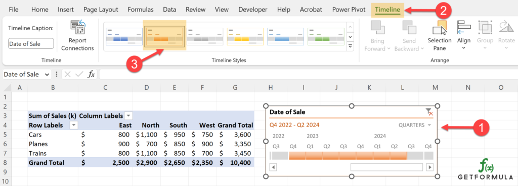
Additionally, you can change your timeline’s ‘Timeline Caption’ on the far left in the ‘Timeline’ ribbon.

Within ‘Show’ on the Timeline ribbon, you can also adjust what is shown on the timeline, such as the Header, Section Lable, Time Level, and Scroll bar.

Lastly, remember that timelines are interactive and connect with the PivotTable. Any filter you apply on the timeline will immediately reflect in the PivotTable. Experiment with different filters to get valuable insights.
Using these advanced techniques, you can make your timelines a tool for data filtering and a powerful feature for data exploration and storytelling.
Managing Multiple Timelines and PivotTables
As your data sets become more extensive, you may find yourself managing multiple PivotTables and PivotTable Timelines within a single Excel workbook.
Here, we’ll look at techniques for effectively managing multiple timelines and PivotTables.
Start by creating different PivotTables based on the different data sets or categories you wish to analyze. Each PivotTable will have its own timeline. The example below uses the same data set with separate PivotTables for Planes and Trains.
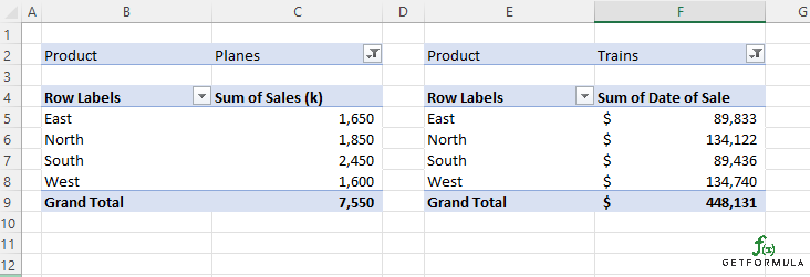
Now create a timeline for each PivotTable. Select a cell within the first PivotTable and go to the ‘PivotTable Analyze’ ribbon. Then, click ‘Insert Timeline’ and choose the date field. Repeat this process for each PivotTable.
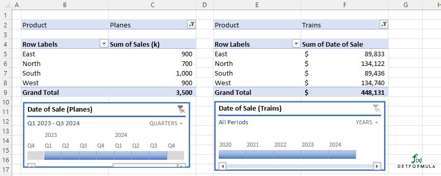
Linking two PivotTables to one Timeline
The benefit of having multiple timelines is that they allow you to filter different PivotTables independently and interactively. However, in some cases, you might want to synchronize the filtering across multiple PivotTables. This is where the ‘Report Connections’ can bring PivotTalbes together.
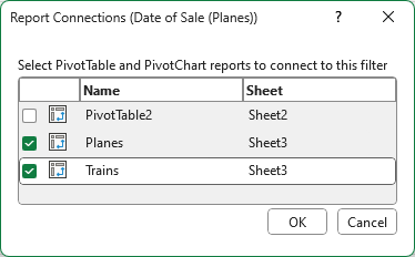
Right-click on a timeline and select ‘Report Connections’. In the pop-up dialog box, you can check the PivotTables that you want to connect with the timeline.
- Note: When managing multiple timelines and PivotTables, the organization is crucial. Rename your PivotTables and timelines to keep track of which timeline corresponds to which PivotTable. This can be done within the ‘PivotTable Analyze’ ribbon.
Once you have selected the two PivotTables, select OK. You will think you will be able to reposition your timeline and desired dates for both PivotTables from a single TimeLine.
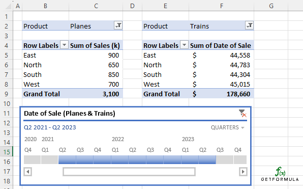
As you build more complex workbooks with multiple PivotTables and timelines, these techniques will keep your work clear, organized, and effective.
How to Link Timeline to Pivot Charts
PivotCharts, a key feature in Excel, offer a dynamic way to visualize your PivotTable data, serving as a useful tool for improved data analysis and interpretation.
PivotCharts’s capability to sync with timeframes in PivotTables and PivotTable timelines provides an ability to enable an interactive data visualization experience.
Once you have created your PivotTable, click on any cell within it, navigate to the ‘Insert’ tab on the Ribbon, and select ‘PivotChart’. Opt for a chart type that aligns with your data visualization needs and hit ‘OK’. Below i selected ‘Insert Column | 2-D Column | Clustered Column’
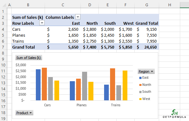
Next, add an integrated timeline to your PivotTable. Your PivotChart will automatically align itself with the timeline settings. Consequently, if you adjust the date filters using the timeline, your PivotChart will immediately update to portray the modified data.
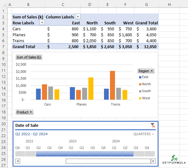
Remember, a PivotChart essentially mirrors your PivotTable in a graphical form. As such, any modifications or filters applied to the PivotTable, including the timeline, will have a corresponding effect on the PivotChart.
This interplay between PivotTables, timelines, and PivotCharts empowers you to present and analyze your data in a far more insightful manner, which really leverages the power of Excel’s advanced functionalities.
Summary Notes:
- A timeline in a PivotTable allows dynamic filtering of date fields to make data analysis more interactive.
- Use the “PivotTable Analyze” tab and select “Insert Timeline” to add a timeline to a PivotTable.
- Right-click on the desired date field and select “Add as Timeline” for an alternative method of adding a timeline.
- Adjust the timeline by sliding the scroll bar or changing the timeframe units for specific data analysis needs.
- Make sure date and time data is in an Excel-recognized format to ensure the smooth functioning of timelines.
- Adjust the units of time in the timeline (years, quarters, months, days) to suit your analysis needs.
- Timelines created for one PivotTable can be connected to another PivotTable using the “Report Connections” button.
- Creating a PivotChart inherently links it to the PivotTable and responds to changes in the PivotTable, including timelines.


